The challenge: a platform migration that needed to be accessible
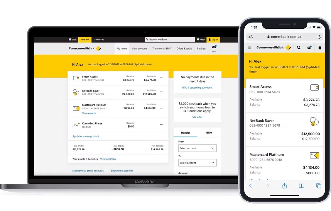
The homepage was part of NetBank Modernisation, a programme that ran from 2017 to 2019. The driving force was moving from old platforms to a cloud-based Digital Platform, which would be faster to deliver on and more secure. The experience goals were to make the page responsive, lift the visual design, and make it the most accessible banking homepage in Australia, starting with WCAG 2.0 compliance.
Customers called NetBank busy and confusing, and not personalised to them. They also said it wasn’t responsive and was hard to use with assistive technology. I was the Senior Experience Designer, and I worked with the Visual Designer, the UX Lead, researchers, an accessibility consultant and the developers. I made responsive wireframes and prototypes, ran A/B first-click testing with the researchers, held weekly build reviews, and contributed to the design system.
I started with what customers said and what they used
I read customer feedback verbatim and spoke to Direct Banking representatives about pain points. I then used analytics to see which parts of the page people engaged with most, which gave us a baseline for judging any change.
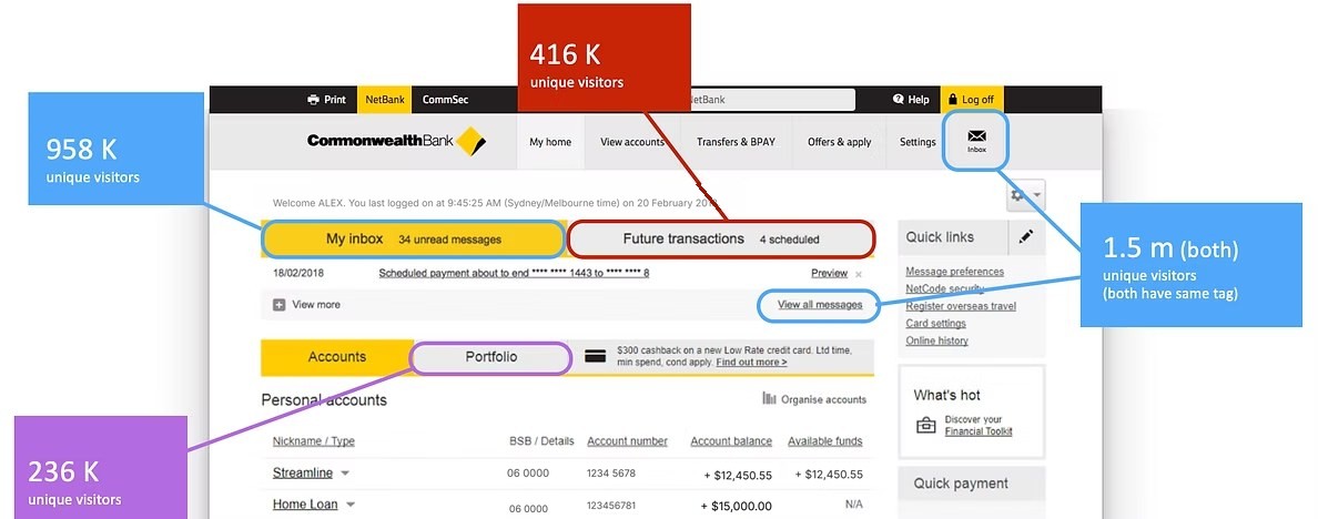
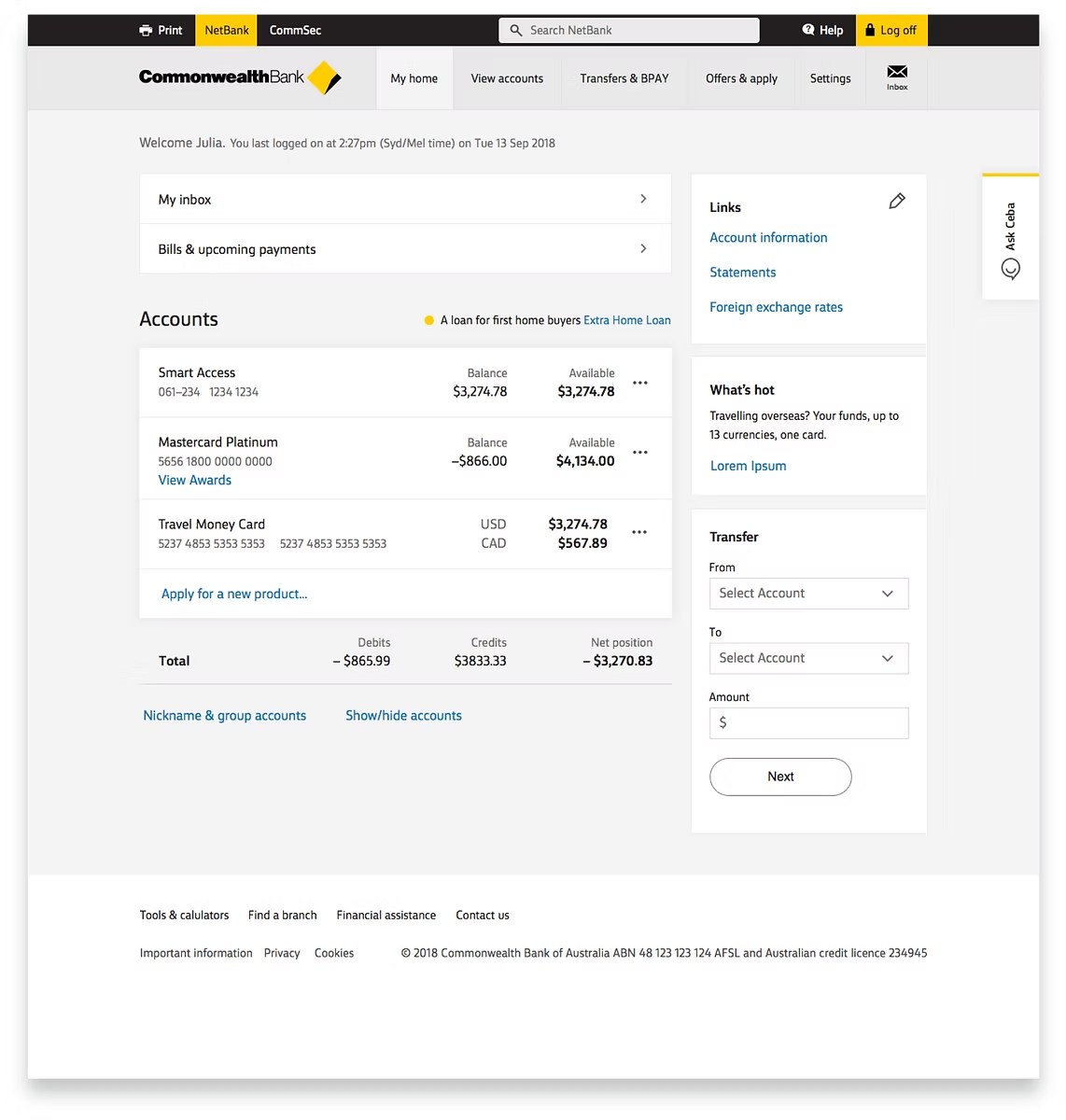
The first design, made with the Visual Designer and UX Lead, used the new bank design language to match the CommBank app, with the focus on responsiveness, accessible font sizes and discoverability. The biggest change was bringing the Inbox and Bills and upcoming payments entry points to the top of the page. Before, they were harder to find in the navigation.
Stakeholders were nervous, so we tested before changing it
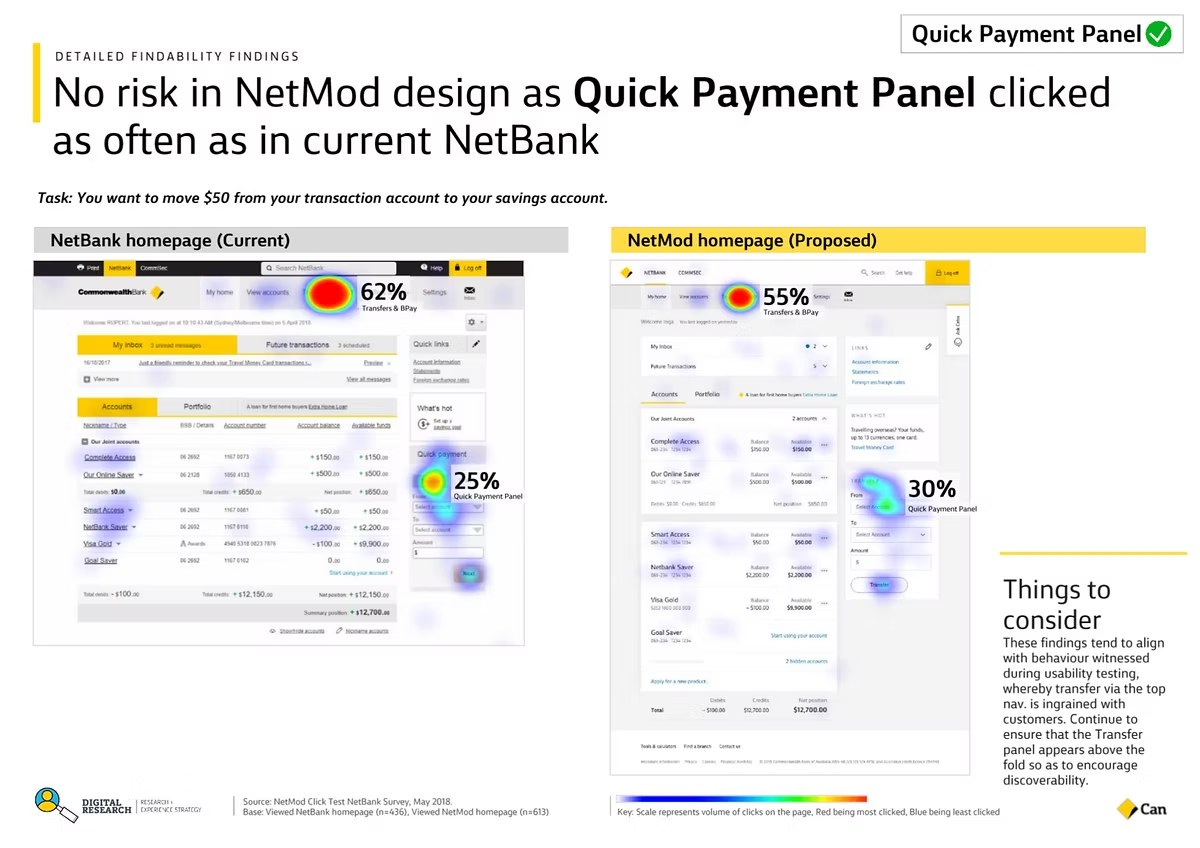
The homepage is the main way into customers’ accounts, and changes to it made stakeholders very nervous. To lower the risk, I planned an A/B first-click test with a UX researcher, with the current design as the control. We compared whether people completed the most common homepage tasks, and how fast. I built wireframes in Axure, and we ran it as a Qualtrics survey that customers reached from a link on the log-out page.
Going beyond compliance: testing with people who use assistive technology
I worked every week with the accessibility consultant to define the requirements in Confluence, covering keyboard focus and the hidden copy for screen readers. I then went through them one to one with the engineers. We hit technical constraints and found that experiences differed across assistive technologies, so we compromised and iterated as a team.
The project team wanted to do more than meet WCAG 2.0 and make the page easy to use. With the UX researcher and the accessibility consultant, I wrote the most common homepage tasks with pass and fail criteria, and we ran ten sessions with people with a range of needs, including low vision, no vision, autism, keyboard-only use and voice-only use. They used JAWS, Dragon and NVDA, and some sessions were in their homes. It was the first time the digital team had tested this way.
It changed how I worked. I understood the challenges many customers face far better, and it helped me argue for accessibility and teach the wider team what I’d learned.
The prominence panel: a sales asset that had to work on a phone
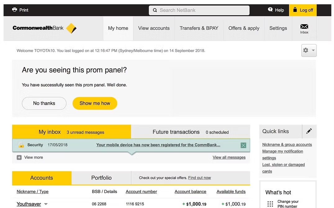
I redesigned the prominence panel, a business-critical sales asset. The old one was a fixed, non-responsive panel at the top, often overlooked by customers, and it was a source of complaints for pushing accounts down the page.
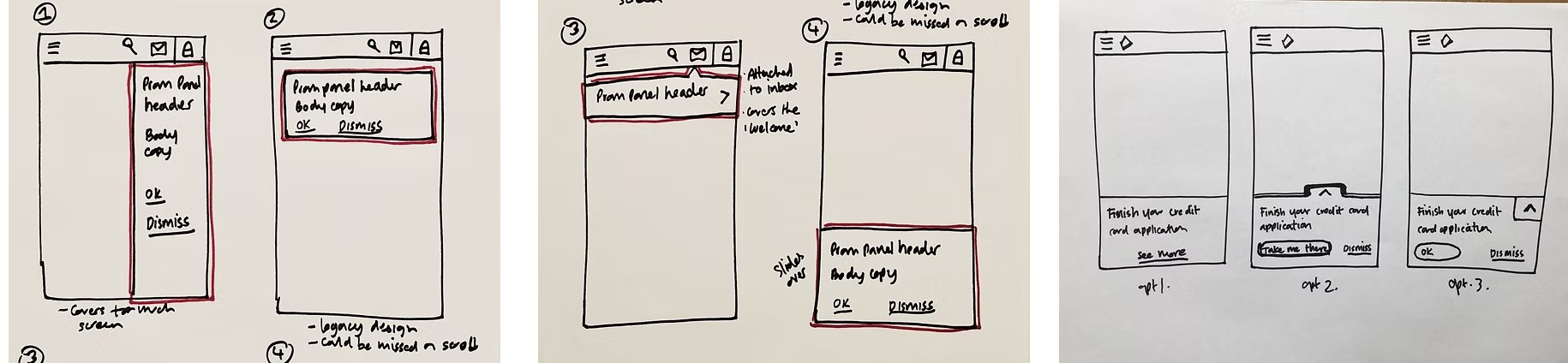
The mobile breakpoint was the hard part. Stakeholders had requirements for character limits, the number of buttons and links, and I tried to negotiate them down. In doing so I learned that some of the messaging had compliance needs, so the requirements had to stay. I sketched several options for fitting them in.
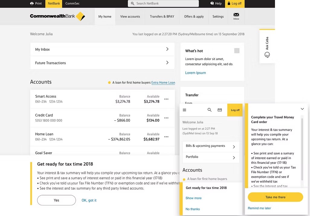
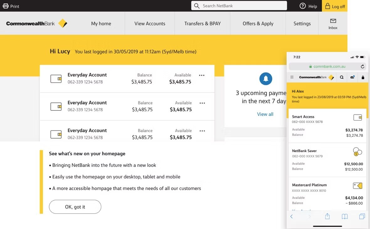
After several rounds of usability testing, I settled on a responsive panel that slides up from the bottom of the screen and stays there. It was more prominent, which pleased stakeholders, and customers in testing didn’t mind where it sat.
A phased pilot, and a lot of feedback to read
We released the first version to a small staff pilot in November 2018, then to 31,000 customers (5%), and up to 61,000 by July 2019, before going to everyone. The small start let us watch feedback closely and improve the design first. The new design made the sales and service assets more discoverable: interaction with the sales link rose 49%, and with the service asset 89%.
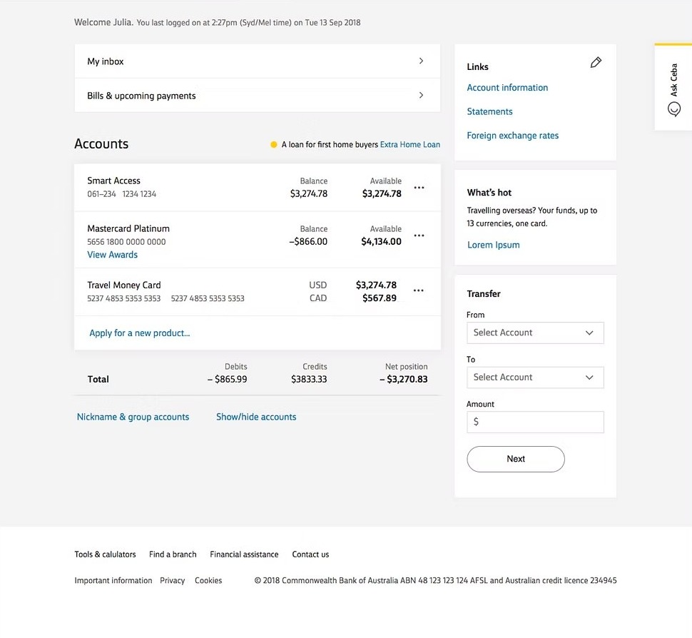
I reviewed the customer verbatims from the feedback panel, grouping them into themes to recommend improvements. For each pilot release I went through more than 2,000 comments, and shared the improvements at weekly backlog refinement meetings so the team could prioritise them.
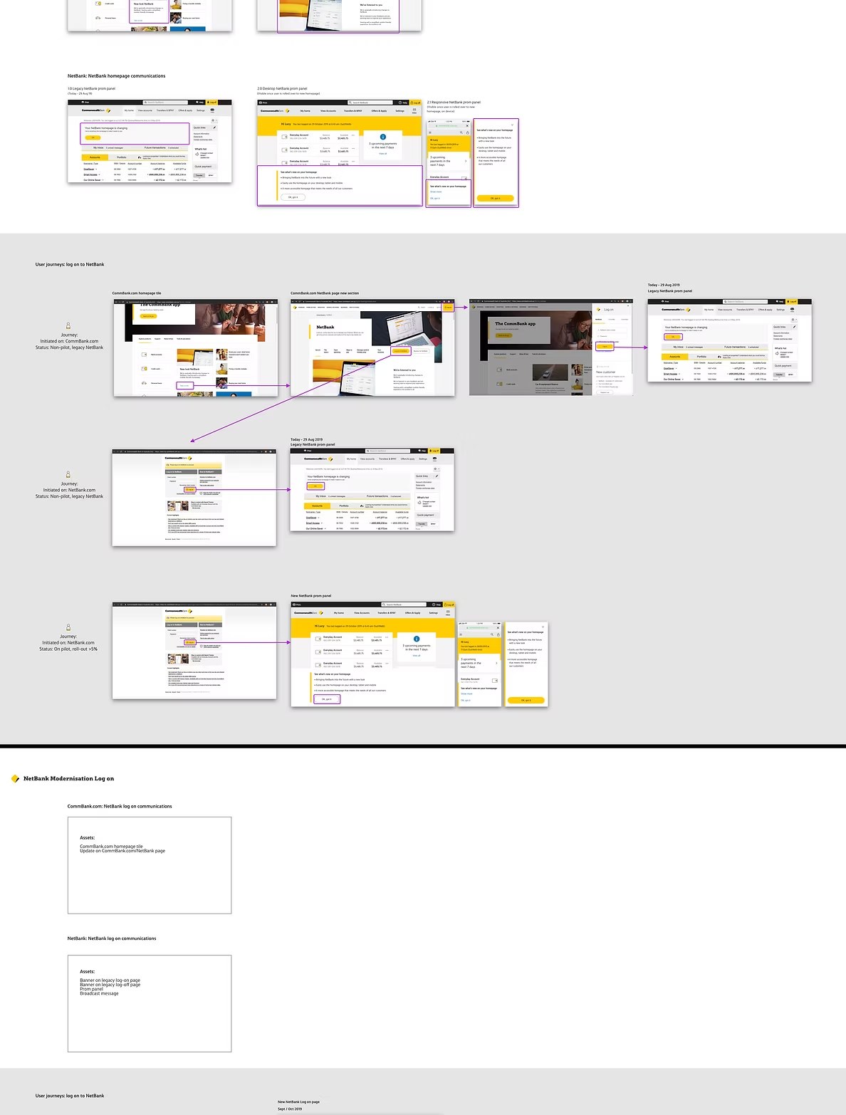
The biggest complaint category was change aversion. That helped me argue for better customer communications in later releases. I mapped the customer journey and every touchpoint where we could explain the change, which led to two more areas on the customer-facing marketing website that announced and explained it.
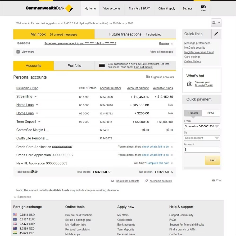
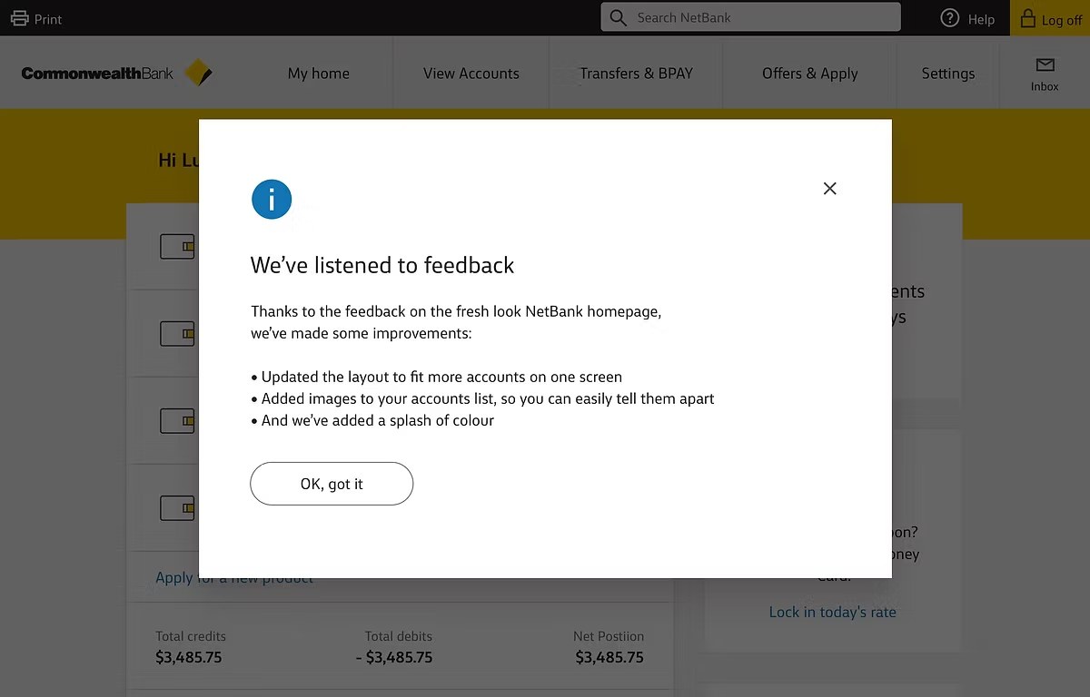
We then released a second version to the same pilot group, directly addressing the biggest complaint themes. We reduced the padding and row height on the accounts list, and added product pictograms to bring some personality to the page. We also told customers we’d listened, what we’d changed, and why, to show we were being transparent and to build trust.
The outcome
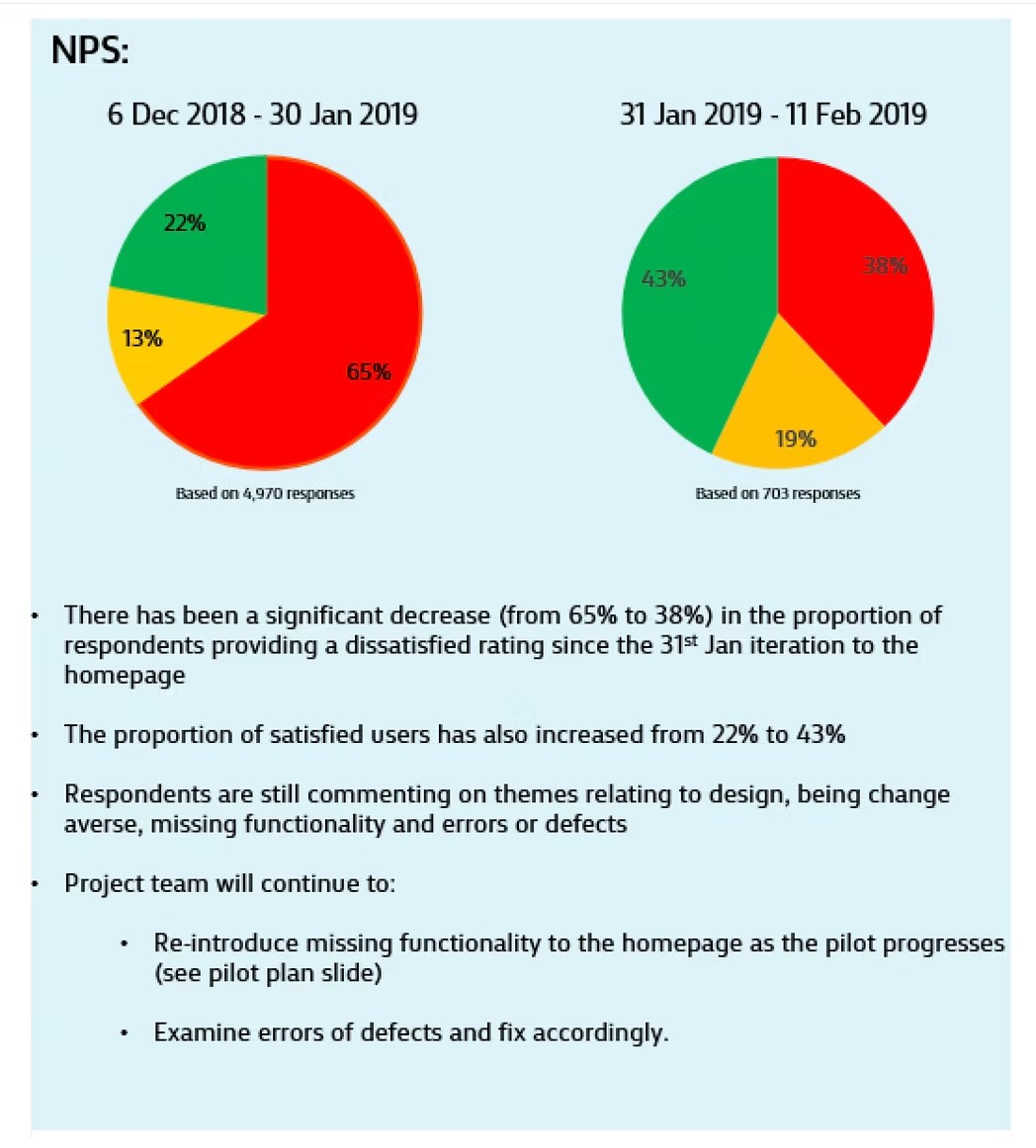
After the second iteration, positive feedback rose from 22% to 43%. Of the 315 people who had left negative scores, 129 now gave a higher one.
- Interaction with the sales link rose 49%, and with the service asset 89%.
- The homepage achieved WCAG 2.0 compliance.
- With research, I ran the first accessibility user testing at Commonwealth Bank.
- I contributed to Honeycomb, the bank’s design system, and was named the top UX design contributor in a team of more than 100 design practitioners.
What I took from it
Plan for change aversion. The biggest complaint was that the page had changed, not any one feature. Communicating clearly, and showing that we’d listened, mattered as much as the design changes.
Test with the people who’ll struggle most. Going beyond a compliance checklist and watching people use assistive technology showed me what a standard would miss.
Use a pilot as a conversation. Releasing in stages let us read thousands of comments, change the design twice, and see the effect of each change.